Tell your story

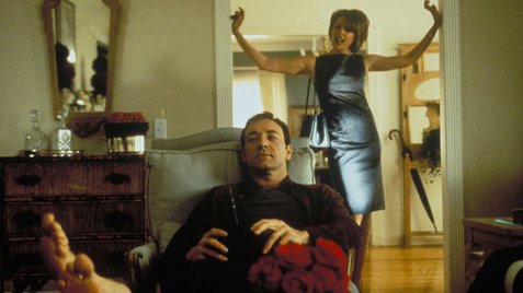
One of my top-5 movies is American Beauty with Kevin Spacey.

(Probably because it arrived in 1999, about the time I realized my middle-aged high-profile professoring life with four daughters was falling apart and divorce would inevitably ensue — it did).

american.beautySpacey has long shown his form as actor, but got it particularly right when he told a conference recently,It begins with knowing what story you want to tell. Everything else will follow.”

Southwest Louisiana farmers were urged to become more effective leaders and better spokespeople for agriculture Tuesday during the Jeff Davis Parish Chamber of Commerce’s annual Farmers Appreciation Breakfast.

Bobby Soileau, director of the LSU AgCenter’s Agricultural Leadership Development Program, shared experiences from the program with the group of 150 farmers and agribusiness leaders.

“If we get people who are better spokespeople for Louisiana agriculture, I guarantee you can make a difference whether it’s in your community or your commodity, whether it’s in the state or nationally,” Soileau said.

“We have people who have been through our program that can make that kind of difference.”

Most of the program comprises lecture-based seminars on communication skills, but the most fun part is getting people out of their comfort zones and thinking about their passions, Soileau said

“Because if you tell your story, it makes a difference,” he said. “People will believe you.”

Sure, this guy is no Kevin Spacey, but tell your story.

Pictures and stories matter: A persuasive chart showing how persuasive charts are

In 1992, while I was working at the University of Waterloo (that’s in Canada), I hosted the annual meeting of the Canadian Science Writers Association.

CoverI brought in some interesting and controversial folks, and because Waterloo was so big on computer graphics, I put together a panel about how images could persuade politicians and mere mortals, and a discussion on the ethical responsibility of such a task.

Heady stuff.

Today, two Cornell researchers, Brian Wansink and Aner Tal, reported in Public Understanding of Science, about a small online survey to assess whether alternative descriptions of the same information were more persuasive. Each respondent read the following description of a mythical drug trial:

“A large pharmaceutical company has recently developed a new drug to boost peoples’ immune function. It reports that trials it conducted demonstrated a drop of 40 percent (from 87 to 47 percent) in occurrence of the common cold. It intends to market the new drug as soon as next winter, following F.D.A. approval.”

When this was the only information given, 68 percent believed that the medication really did reduce illness.

Then for a randomly selected subsample, the researchers supplemented the description of the drug trial with a simple chart. But here’s the kicker: That chart contained no new information; it simply repeated the information in the original vignette, with a tall bar illustrating that 87 percent of the control group had the illness, and a shorter bar showing that that number fell to 47 percent for those who took the drug.

But taking the same information and also showing it as a chart made it enormously more persuasive, raising the proportion who believed in the efficacy of the drug to 97 percent from 68 percent. If the researchers are correct, the following chart should persuade you of their finding.

What makes simple charts so persuasive? It isn’t because they make the information more memorable — 30 minutes after reading about the drug trials, those who saw the charts were not much more likely to recall the results than those who had just read the description. Rather, the researchers conjecture, charts offer the veneer of science. And indeed, the tendency to find the charts more persuasive was strongest among those who agreed with the statement “I believe in science.”

French and Spanish food safety infosheets now available at bites.ksu.edu

Amy is a French professor.  Her influence on me has been profound – and has even involved some language awareness stuff.

That’s why we have don’t eat poop shirts in French, Chinese and Spanish.

You’d figure that getting stuff translated into other languages would be a breeze, since I have an in with the department. But to do it in real-time is a bit messy. The first time I tried to upload a French infosheet, last week, I crashed the entire bites.ksu.edu site.

Damn you, France.

We’ve been messing around but are reasonably confident we’ve got the people and technology in place to at least translate food safety infosheets on a weekly basis. The Spanish food safety infosheets are available at http://bites.ksu.edu/infosheets-sp, and the French food safety infosheets are available at http://bites.ksu.edu/infosheets-fr.