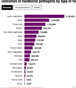
Friend of the barfblog.com Michael Batz, says there is a difference between “which foods are most likely to get you sick?” and “which foods cause the greatest burden in the U.S.?”
So he provided commentary on a story he helped create.
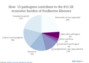
The story ran in Fortune, and claimed the U.S. economy will take a $15.5 billion dollar food safety hit through lost income, lost revenue, healthcare-related costs and some intangibles, like “pain and suffering,” according to the U.S. Department of Agriculture.
Research shows the most common foodborne pathogen is norovirus, which is the leading cause of gastroenteritis. The most deadly is listeria; though it is rare, with just 123 confirmed cases in 2013, 24 led to death. The most expensive is salmonella, which is quite common — 7,277 cases in 2013, but with a small fraction (127) resulting in death.
How worried should Americans be about the safety of the food supply? Which foods are most likely to get Americans sick? A deep dive into the data offers a look at where the risks lie.
To identify the most dangerous foods, the Emerging Pathogen Institute, a research institute at the University of Florida, compiled a greatest hits of dangerous pathogen/food pairings. Using a methodology that combined the likelihood of contracting an illness and the illness’s severity to calculate total disease burden, the group identified a Top Ten list of combinations.
| Rank | Food and Pathogen | Cost | Illnesses | Hospitalizations | Deaths |
| 1 | Poultry (campylobacter) | $1,257m | 608,231 | 6,091 | 55 |
| 2 | Pork (toxoplasma) | $1,219M | 35,537 | 1,815 | 134 |
| 3 | Deli meats (listeria) | $1,086M | 651 | 595 | 104 |
| 4 | Poultry (salmonella) | $712M | 221,045 | 4,159 | 81 |
| 5 | Dairy products (listeria) | $724M | 434 | 397 | 70 |
| 6 | Complex Foods (salmonella) | $630M | 195,655 | 3,682 | 72 |
| 6 | Complex foods (norovirus) | $914M | 2,494,222 | 6,696 | 68 |
| 8 | Produce (salmonella) | $548M | 170,264 | 3,204 | 63 |
| 8 | Beef (toxoplasma) | $689M | 20,086 | 1,026 | 76 |
| 10 | Eggs (salmonella) | $370M | 115,003 | 2,164 | 42 |
The top pairings don’t necessarily map to the major outbreaks of disease; only four of the top ten outbreaks in 2014 were from pairings on the list. J. Glenn Morris, director of the Emerging Pathogen Institute, told Fortune that, outbreaks are “a small fraction” of the total number of foodborne illnesses. In most cases, foodborne illnesses are limited to a small group of people, which makes it difficult for authorities to track.
 Batz explains the which-foods-cause-the-greatest-burden-in-the-U.S. is about everyone. It is the summary row in a table with 300 million lines, each row representing a different person. Each row could be considered something like individual risk.
(You think you’re a special snowflake? Nope, you’re just a row in the giant spreadsheet of life.)
Our individual risks differ so greatly. Unless you’re pregnant, you don’t need to worry about transmitting Listeria monocytogenes or Toxoplasma gondii to your fetus. Your risks go up when you’re immunocompromised, particularly for some bugs. The young and old face increased risks, though again, every disease is different. People of different ages and genders have different food consumption patterns, too.
And even then, that one row represents risks faced at every meal over the course of a year. Some foods have much higher risks per serving, yet we don’t eat them that often. We consume other foods with lower risks per serving in very high quantities. When you’re telling someone which foods are riskiest, which do you mean? It’s tricky.
Five or so years ago, my colleagues and I published the results of trying to just get at that summary row. Or to be more specific, we tried to say something about which pathogens, which foods, and which pathogen-food pairs cause the greatest public health impact. This kind of information is, I believe, important for getting a handle on the landscape of foodborne disease, to help guide our efforts to reduce the burden.
 The report had a punchy “top ten” type title and got some attention (for which I’m thankful). But the attention has always come with a price, and that price is that when work like this is written up, it’s almost always presented to readers as some version of which foods to avoid.
I get it, I really do. It’s natural to frame things to readers this way, to take research and make it personally relevant to them. But it kind of butchers the work, and can do as much to misinform as to educate.
So kudos to Tamar Haspal of Fortune for mostly getting it right in an article that presents risks at the broad, national level. Boo to whoever wrote the headline, which conflates population and individual risk and asks “which foods are most likely to make you sick?”
Translating research is always tricky, and I’m never quoted quite to my satisfaction (I can’t get none). In the article, I say we value mortality at $8.7 million per life lost because “there’s also a social welfare value to a life.” Well, that’s not quite right, and I’m doubtful I put it quite that way, and my economist friends are likely groaning at the phrasing, but it’s fine. It’s mostly right, anyway. You have to learn to turn the other cheek.
But other things I just can’t let go. Like the fact that, for the record, I hate pie charts.
